AskNestlé · Nestlé India · via Design Brewery · 2022
When 41M parents needed better nutrition guidance.
A mobile-first nutrition platform for parents who read on their phones, often in Hindi.
- Recipe task success
- +40%
- Drop-off on recipe pages
- −20%
- Meal plans generated
- 1.2M
- Role
- UI/UX Design Intern
- Team
- 2 designers, 1 developer
- Timeline
- May - Jul 2022
- Platform
- Mobile-first responsive web
- Sector
- FMCG · Nutrition
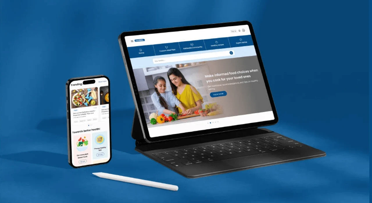
AskNestlé gives Indian parents nutrition guidance, recipes and meal plans. The site was desktop-first while 95% of visitors were on phones, and 77% never came back. We redesigned it mobile-first around what parents actually used: quick recipes, findable personalisation tools, and Hindi that reads as native rather than translated.
- Parent visits to the platform
- 41.2MScale
- Personalised meal plans generated
- 1.2MScale
- Task success in the recipe discovery flow
- +40%Contribution
- Drop-off on recipe and meal-planning pages
- −20%Contribution
Problem
Built for a desk, used on a phone.
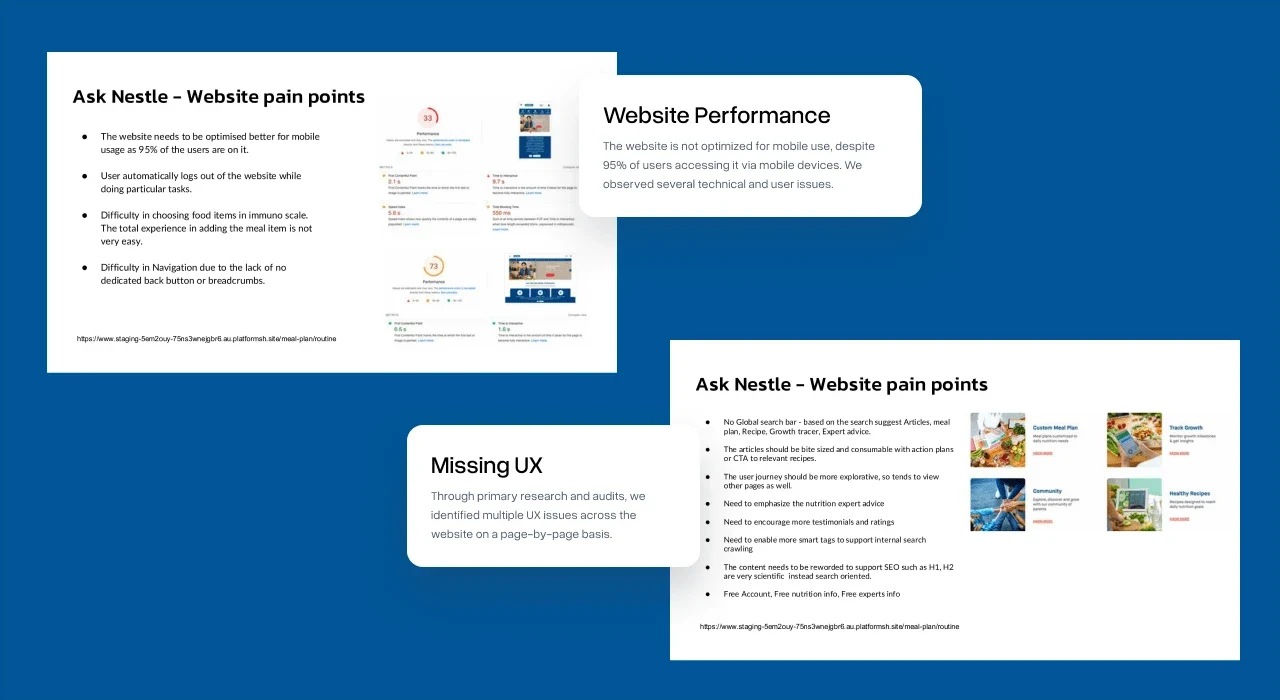
The existing site loaded slowly, logged people out and made a simple recipe search difficult. Analytics showed strong interest in health, nutrition and meal plans, but the experience got in the way.
- 95% of users were on mobile; the design was desktop-first.
- 77% never returned, largely because of confusing navigation.
- Expert articles were dense and mostly ignored.
- Hindi was missing, although more than 1M users preferred it.
- Personalisation tools existed but were hard to find.
Research
Recipes beat articles.
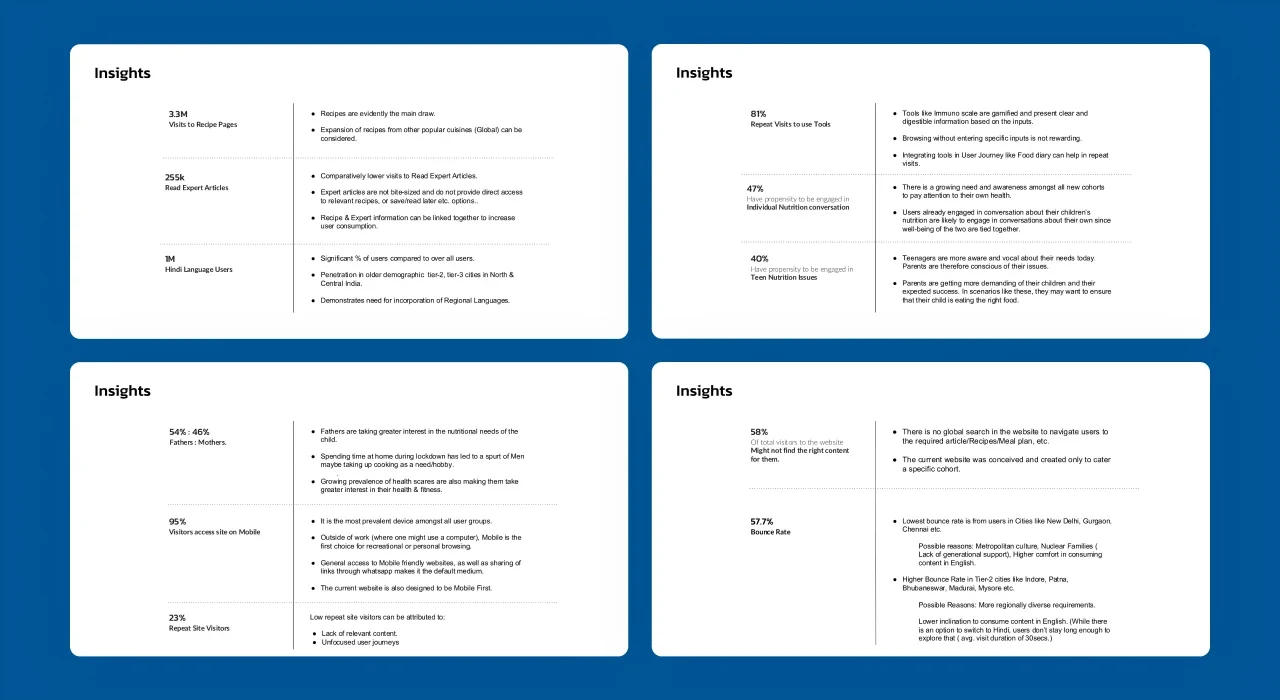
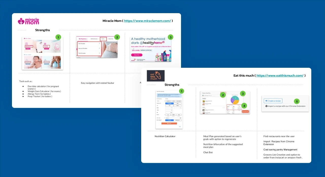
We combined analytics, user research and a competitor review. Four findings shaped the redesign.
Recipes are the product
Quick, actionable meal ideas outperformed long expert articles.
Fathers are involved
Dads were increasingly part of nutrition decisions, not an edge case.
Personalisation was buried
People valued the tools once they found them. Most never did.
Hindi is access
Regional language support was essential, not a nice-to-have.
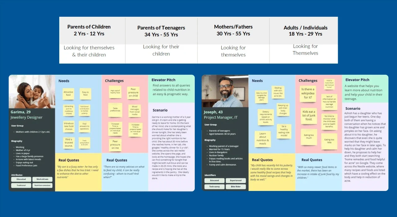
Two personas kept the team specific. Garima, a working mother managing her toddler's nutrition on her phone during the commute, and Joseph, a father planning meals for a teenager.
Structure
Organised around goals, not the org chart.
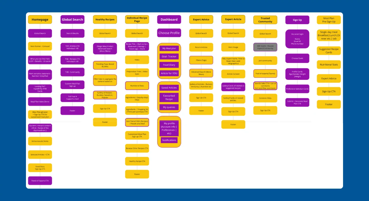
The old information architecture mirrored how the company was organised. We regrouped content around what parents came to do: find a recipe, plan the week, check a child's nutrition, read a short answer.
Design
One hand, one thumb, one answer.
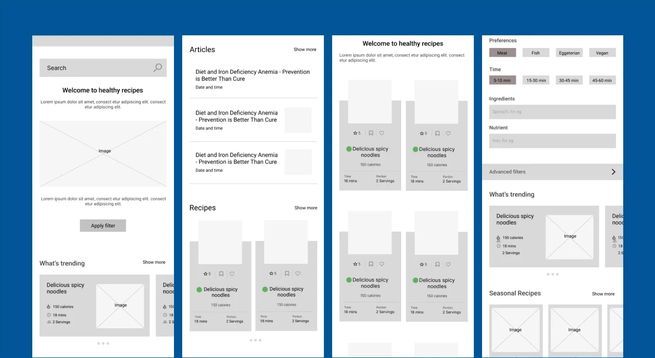
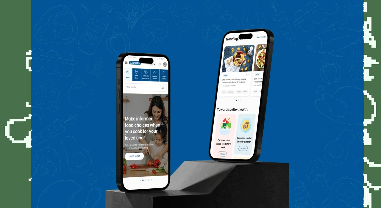
- Mobile-first, thumb-driven. Primary actions sit within reach for one-handed use.
- Bite-sized content. Expert articles became short, actionable cards.
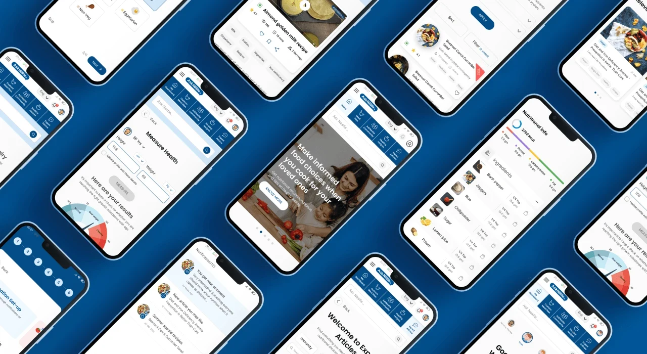
- Personalisation up front. Meal planning and tools such as the immunity scale moved onto the main paths.
- Native bilingual design. English and Hindi layouts were designed together, not translated afterwards.
- Performance as trust. In a health context, a slow page reads as an unreliable one.
Outcome
Simpler decisions for parents.
Within the redesign, recipe discovery task success improved by 40%, activation and retention by 25%, and drop-off on recipe and meal-planning pages fell by 20%. At platform scale, AskNestlé has seen 41.2M parent visits, 1.2M personalised meal plans and 3.7M articles read.
Reflection
Specific beats general.
- Context over labels. “A working mother checking toddler nutrition on her commute” produced better decisions than “parents”.
- Reliability is credibility. In health, performance is part of the content.
- Regional language users are a core segment. Designing for them from the start was cheaper than retrofitting.