SportsMarkers · SquareResults · 2026
0 to 1 in two months: one system for athletes and recruiters.
Talent deserves to be seen. A brand and design system for athlete recruitment.
- Coded components
- 21
- Colour tokens
- 25
- Themes from one system
- 2
- Role
- Sole designer
- Company
- SquareResults
- Timeline
- 1-2 months
- Scope
- Branding to production handoff
- Platforms
- Responsive web · Mobile, dark and light
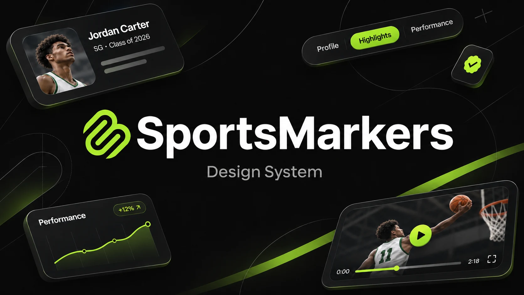
SportsMarkers is a portfolio pipeline between athletes and recruitment teams: one place for an athlete’s stats, achievements and highlights. As the sole designer at SquareResults, I took it from zero to production handoff in one to two months: a single-stroke “Marker M”, a lime accent that reads as go, dark and light themes driven by the same token roles, and atomic components for web and mobile.
- Themes, dark and light, from one set of token roles
- 2Scale
- Colour tokens, each with a documented role
- 25Scale
- Type styles across desktop and mobile
- 23Scale
- Component libraries: three tiers, each for web and mobile
- 6Scale
What it is
More than a highlight reel.
A video can show a great moment. Recruiters also need the context around it: performance, achievements, experience and the journey behind the athlete.
SportsMarkers was conceived as a portfolio pipeline between athletes and recruitment teams. My job was to build the visual identity and the interface system that could hold that whole story together, for two audiences who want very different things from the same page.
The athlete’s story
- Performance statistics
- Achievements and experience
- Video highlights
One portfolio.
Structured. Consistent. Shareable.
The recruitment team
Discover.Understand.Evaluate.
Audience
Athletes
Want a professional digital footprint: a career-long highlight reel that looks premium enough to earn a second look.
Audience
Recruiters
Scouts and coaches comparing many prospects at once. They need dense, verifiable data they can process in seconds.
At a glance
The system at a glance.
Seven foundations, each a set of decisions the rest of the product builds on.
The mark
A marker, drawn in one stroke.
The mark is the brand’s signature: one geometric stroke that marks talent for the next level.
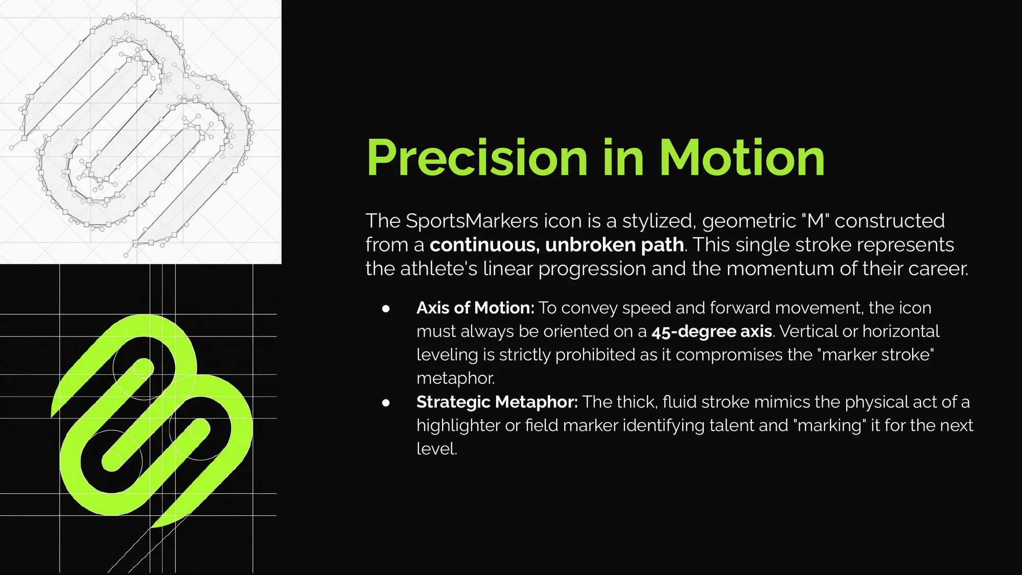
The icon is a geometric “M” built from one continuous, unbroken path: the athlete’s progression as a single line. Its thick stroke borrows the gesture of a highlighter or field marker, picking talent out and marking it for the next level. It always sits on a 45° axis, because leveling it would lose the sense of forward motion.
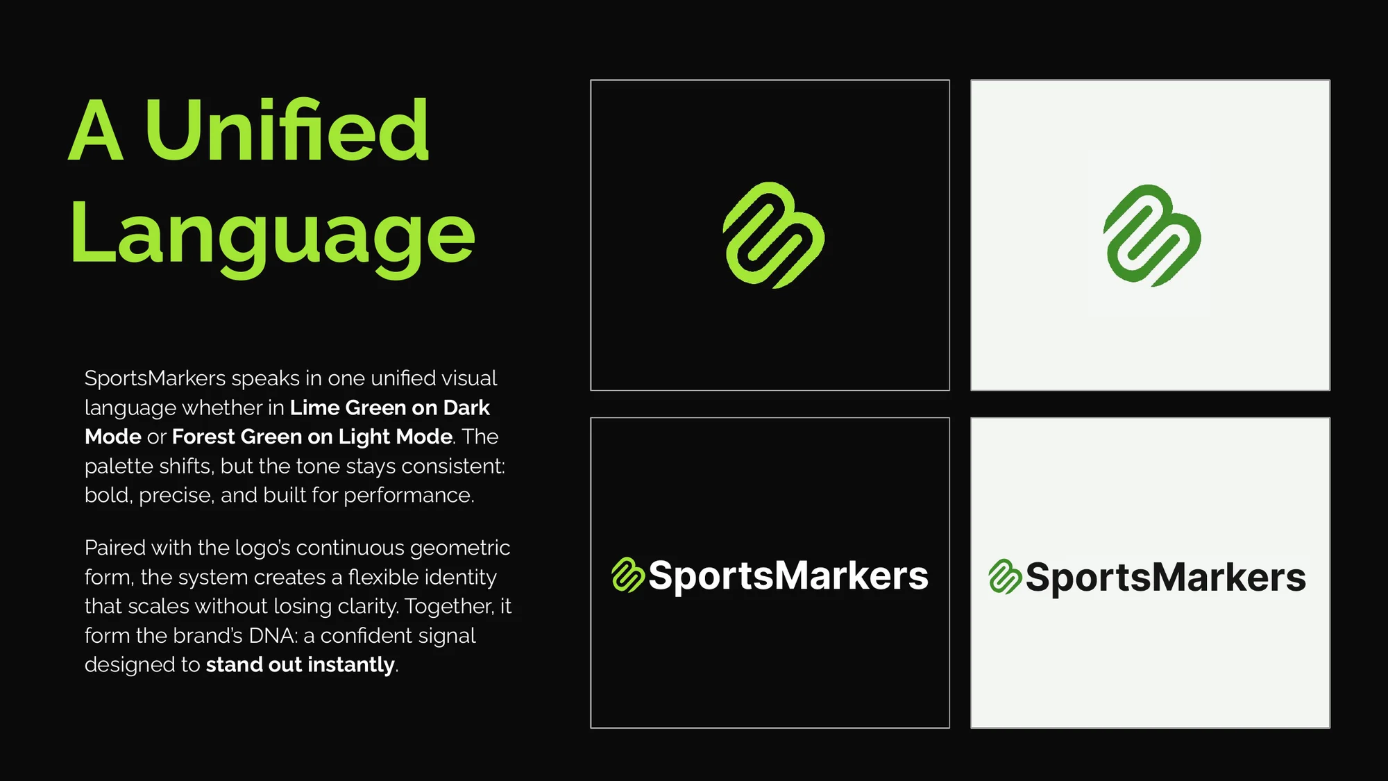
- Horizontal lockup for navigation and headers: icon left, wordmark right, the bold Inter weight matched to the icon’s stroke.
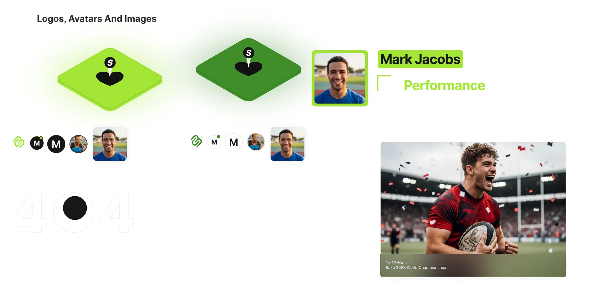
- Standalone icon for favicons, avatars and the “marker” badge on profiles.
- Clear space of half the icon’s height on every side.
- PascalCase only. “SportsMarkers” splits the two words without a space; lowercase versions are not allowed.
Do
- Keep the icon on its 45° axis.
- Use the horizontal lockup in navigation and headers.
- Leave clear space of half the icon’s height on every side.
Don’t
- Rotate or level the icon.
- Write “sportsmarkers” or “Sportsmarkers”.
- Let text or interface elements enter the clear space.
Colour
One accent, two kinds of light.
Colour carries meaning first: one accent means act, and everything else stays neutral.
Lime is the colour of turf, of a heads-up display, of a go signal, and it cuts through visual noise on black. Dark mode is where athletes are showcased: profiles and public landing pages. Light mode, “Training Day”, swaps lime for Forest Green and is for the long, dense sessions recruiters spend in dashboards.
The theme follows the visitor’s browser setting, so nobody has to find a toggle first. A deep blue appears in only one place, as the blurred background gradient, so the green is the only colour that ever means “act”.
Dark
Lime
#A3E635
CTAs, focused and active states
13.05:1 on background
Black/900
#0B0B0B
Website background
Surface
Gray/950
#121212
Card background, ‘after’ section
Surface
Gray/900
#171717
Primary card background
Surface
Gray/800
#1F1F1F
Sport tags on player cards
Surface
Gray/700
#2F2F2F
Portfolio stats, button and card strokes
Surface
White/900
#FFFFFF
Primary text
19.68:1 on background
White/70
#FFFFFF · 70%
Subtext
9.70:1 on background
White/55
#FFFFFF · 55%
Inactive navigation
6.24:1 on background
Blue
#174084
Background blur gradient only
1.97:1 on background
Light · Training Day
Forest Green
#3F8E29
CTAs, focused and active states
3.92:1 on background
White/Bg
#FAFAF7
Website background
Surface
White/900
#FFFFFF
Card background
Surface
White/800
#E6E8E0
Portfolio stats, button and card strokes
Surface
Gray/900
#171717
Primary text
17.14:1 on background
Gray/70
#171717 · 70%
Subtext
6.50:1 on background
Gray/45
#171717 · 55%
Inactive navigation
3.94:1 on background
Gray/800
#1F1F1F
Sport tags
15.76:1 on background
Blue
#174084
Background blur gradient only
9.54:1 on background
Do
- Use the accent only for CTAs, focus and active states.
- Let the theme follow the visitor’s browser setting.
- Use the opacity tokens for subtext (70%) and inactive navigation.
Don’t
- Use the blue for anything but the background gradient.
- Set lime text in the light theme; it falls under 1.5:1.
- Introduce a second accent for decoration.
Type
One family, built for scanning.
Typography sets the sizes, weights and spacing that make an athlete’s numbers readable in seconds.
The whole identity runs on Inter. It was drawn for screens, stays clean in stat tables and on small phones, and its neutral tone keeps attention on the numbers. Headlines go bold for athlete names and data headers; body copy gets generous line height so portfolio descriptions scan quickly. Web buttons use Manrope Bold so calls to action read as a distinct voice.
Display
Hero headers and athlete names.
H1 · Hero
Inter · 800 · 64px
LH 110% · LS -1%Mark Jacobs
Headings
Section and data headers.
H2
Inter · 700 · 48px
LH 100% · LS -3%Top Stats
H3
Inter · 700 · 36px
LH 130% · LS -3%State Finals 25’
H4
Inter · 600 · 32px
LH 150% · LS 0%Career Timeline
H5
Inter · 600 · 24px
LH 130% · LS 0%Athlete of the Week
Body
Descriptions, stats and metadata.
P · Regular
Inter · 400 · 24px
LH 40px · LS 1%A career-long highlight reel.
P · Light
Inter · 300 · 24px
LH 40px · LS -2%A career-long highlight reel.
P · Bold
Inter · 500 · 20px
LH 32px · LS -3%100 Meters Dash · 10.2 Secs
P · Small
Inter · 500 · 18px
LH 150% · LS 0%Tempe, AZ · By Runners Association
P · X Small
Inter · 400 · 16px
LH 150% · LS -1%32 Matches · 08 Goals · 12 Assists
P · XX Small
Inter · 400 · 14px
LH 150% · LS -1%AZ Sports Daily · Oct 25’
Small print
Legal lines and footnotes.
P · Footer
Inter · 400 · 12px
LH 15.6px · LS -3%© SportsMarkers Inc. All rights reserved.
Calls to action
Button labels, in Manrope Bold.
CTA · Large
Manrope · 700 · 24px
LH 150% · LS 0%View Portfolio
CTA · Small
Manrope · 700 · 14px
LH 150% · LS 0%View Event Details
Display
Athlete names on small screens.
H1
Inter · 800 · 35px
LH Auto · LS -1%Mark Jacobs
Subheads
Card titles and section labels.
SubH
Inter · 700 · 20px
LH Auto · LS -1%Top Stats
SubH 2
Inter · 400 · 24px
LH 40% · LS 1%New Season Ready
SubH 3
Inter · 700 · 24px
LH 40% · LS 1%State Record
SubH 4
Inter · 300 · 24px
LH 40% · LS 1%Sprint Athlete · AZ
Body
Reading text and metadata.
Body
Inter · 400 · 18px
LH 30% · LS 1%Unified portfolios for every athlete.
Body 2
Inter · 400 · 16px
LH 150% · LS -3%By Runners Association
Calls to action
Button labels, in Inter Semi Bold.
CTA · Small
Inter · 600 · 16px
LH 150% · LS 0%View Profile
CTA · Large
Inter · 600 · 20px
LH 36% · LS -3%Get Started
Do
- Use Inter everywhere except web CTA labels, which use Manrope Bold.
- Keep body line height generous, around 1.5, so descriptions scan.
- Set athlete names and data headers in bold.
Don’t
- Bring in another typeface.
- Rely on weight or colour alone to carry meaning.
- Add sizes outside the scale.
Tokens
One role, a value per theme.
Tokens connect a raw value to the job it does, so a theme change never needs a second component.
Every colour token is named by what it is and documented by what it does: website background, primary card, stats and strokes, CTAs. Components ask for the role, not the hex, so the same player card renders correctly in either theme without a second version.
Showing the dark values
- 1 · ValueLime #A3E6352 · RoleCTAs, focused and active states3 · Primary CTAView Portfolio
- 1 · ValueGray/900 #1717172 · RoleCard background3 · Player cardMark Jacobs
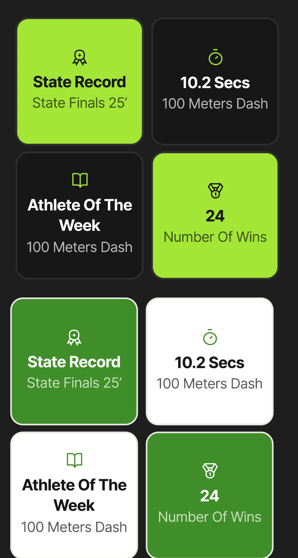
- 1 · ValueGray/700 #2F2F2F2 · RolePortfolio stats, strokes3 · Stat tile32Matches
Components
Atoms to organisms, web and mobile.
Components are built in three tiers, so every screen is assembled from parts that already agree.
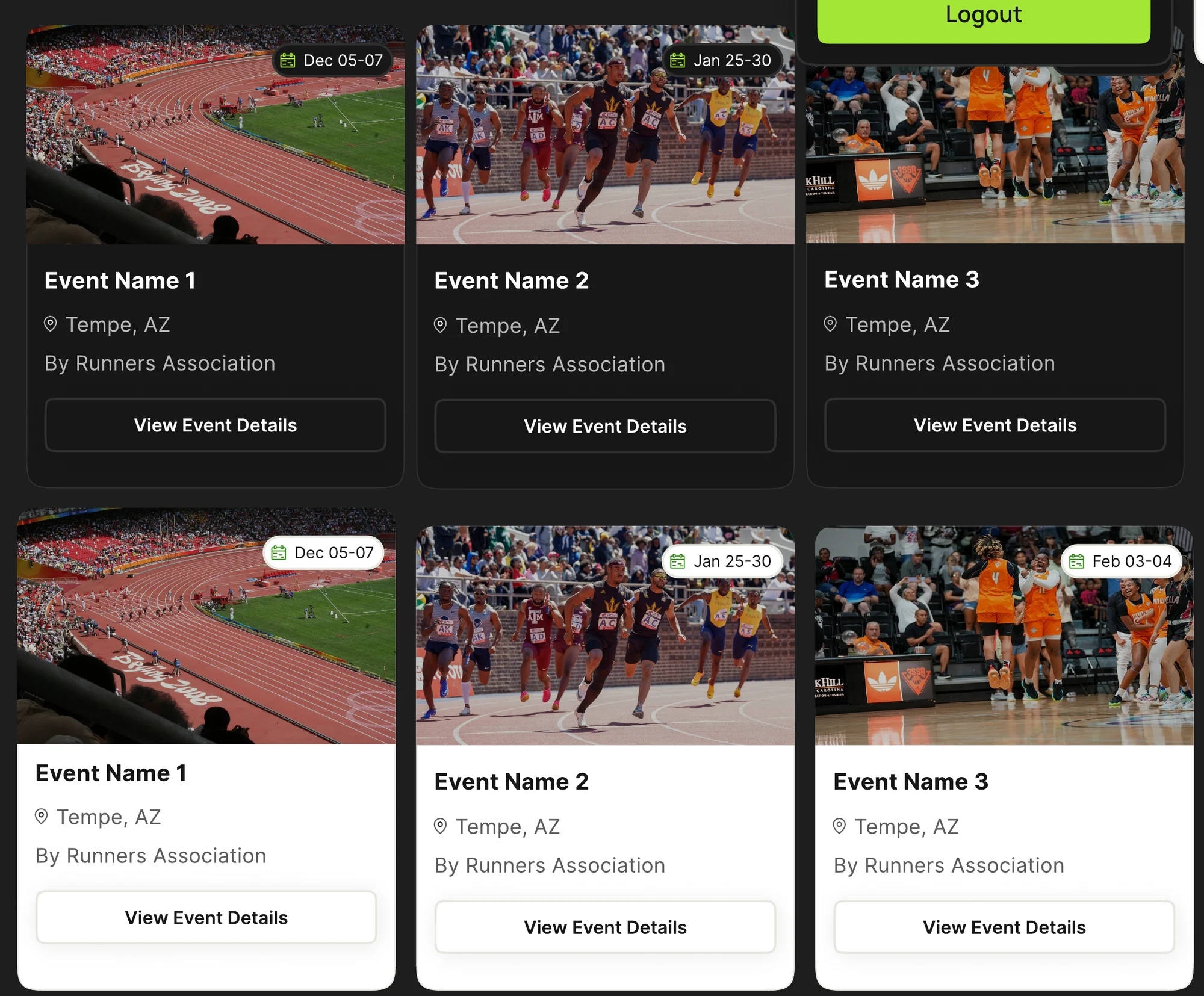
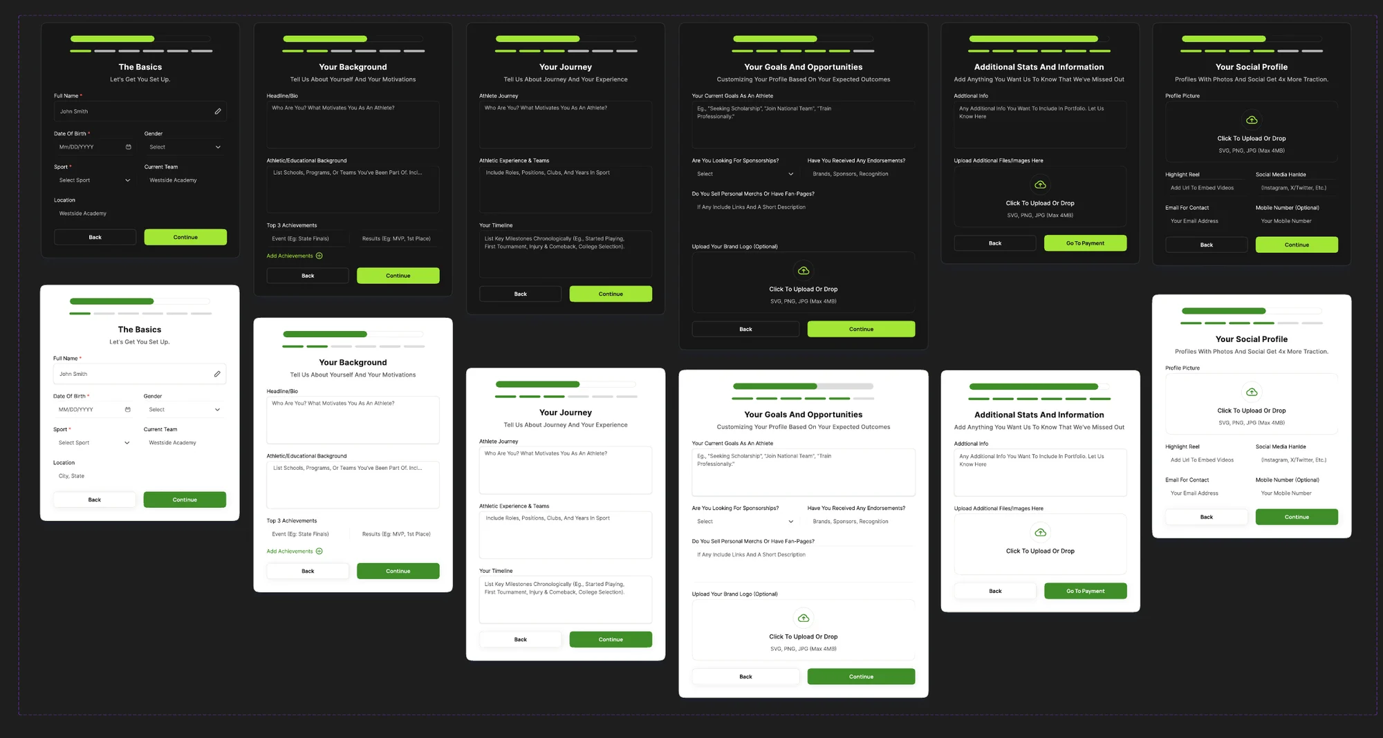
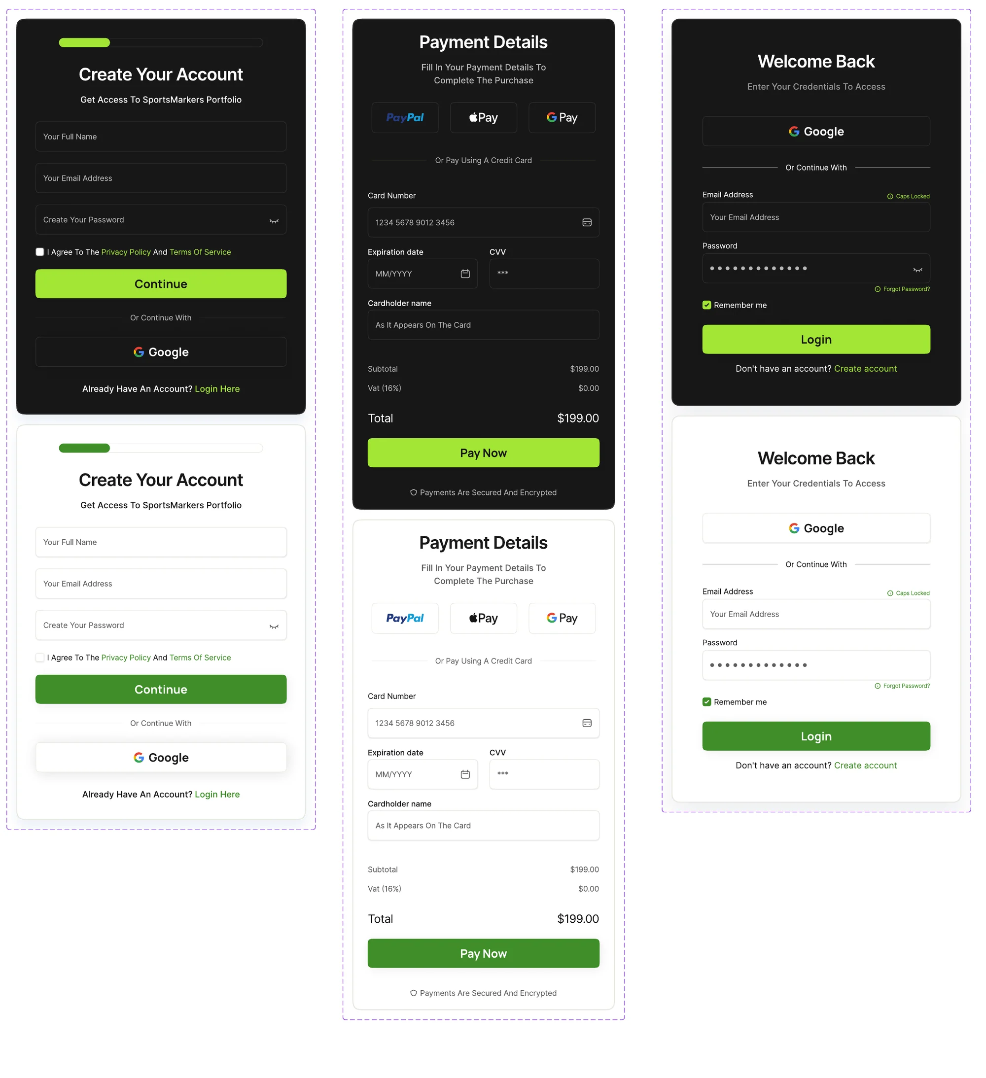
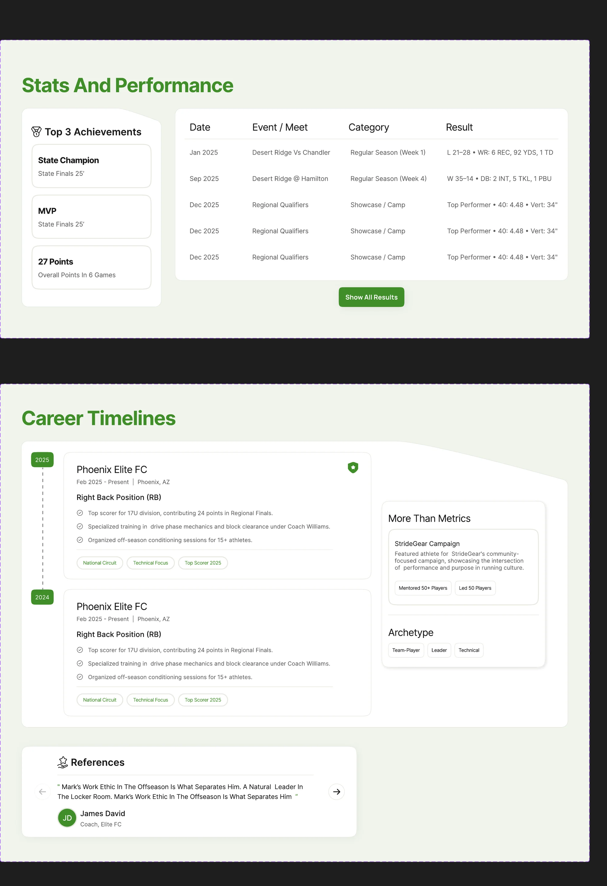
The library is built in three tiers, each with a web and a mobile sheet. Atoms are buttons, inputs, tags, avatars and empty states. Molecules combine them into stat tiles, event cards, player cards, pricing, sign-in and payment. Organisms are whole sections: onboarding, highlights, stats and performance, career timelines.
I used shadcn/ui as a reference for a developer-friendly component structure, so engineers would recognise the patterns. The visual language stayed SportsMarkers’ own.
Living component library
21 specimens · atoms, molecules and organisms · real React components
Atom
Actions
Primary, secondary, outline and ghost; small, large and icon-only; hover, press, focus, selected, disabled and loading.
Hover, press, focus, selected, disabled, and loading states. Manrope is used for every CTA.
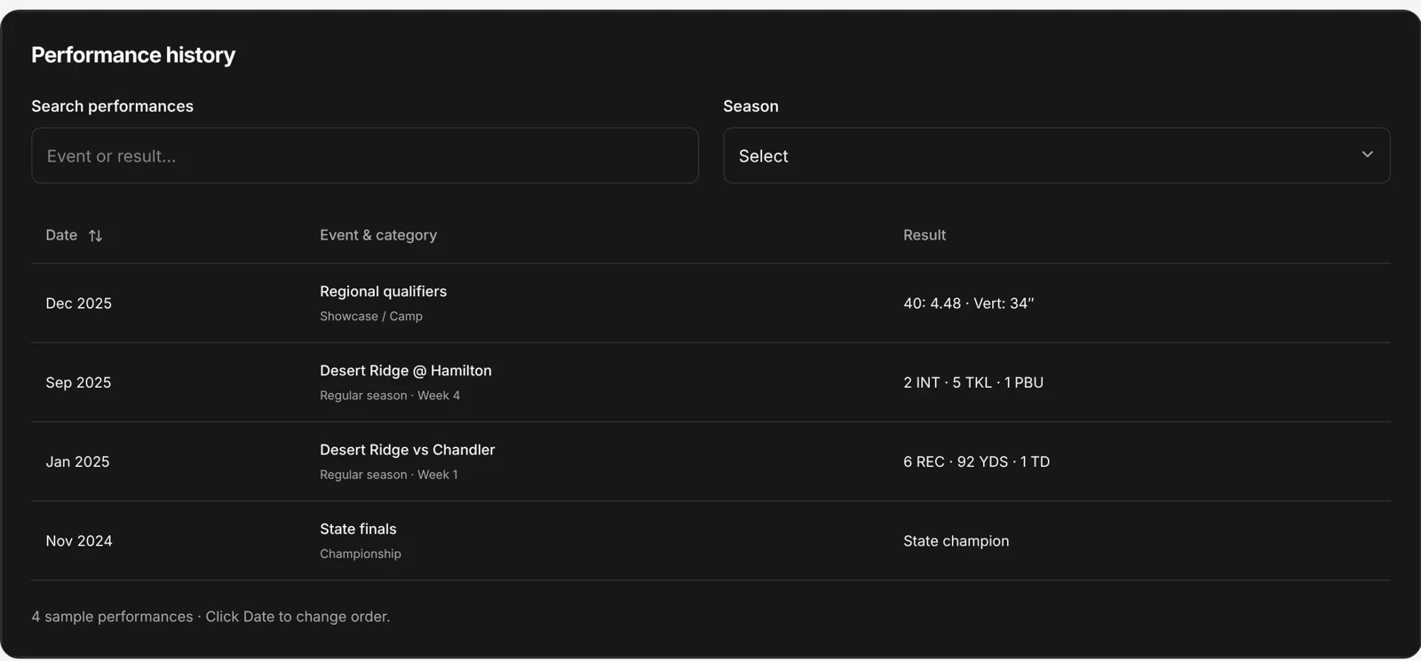
Sample names, results, prices and content. Forms, accounts and payments run locally and send nothing.
Atom · Buttons
Default
Atom · Search field
Empty
Atom · Sport filters
None
All sports · 48 athletes
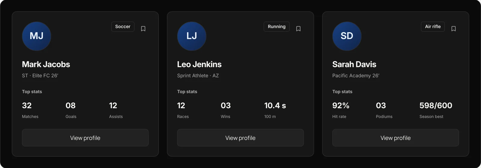
Molecule · Player card
Default
Mark Jacobs
ST · Elite FC 26’
32
Matches
08
Goals
12
Assists
Molecule · Portfolio tabs
Overview
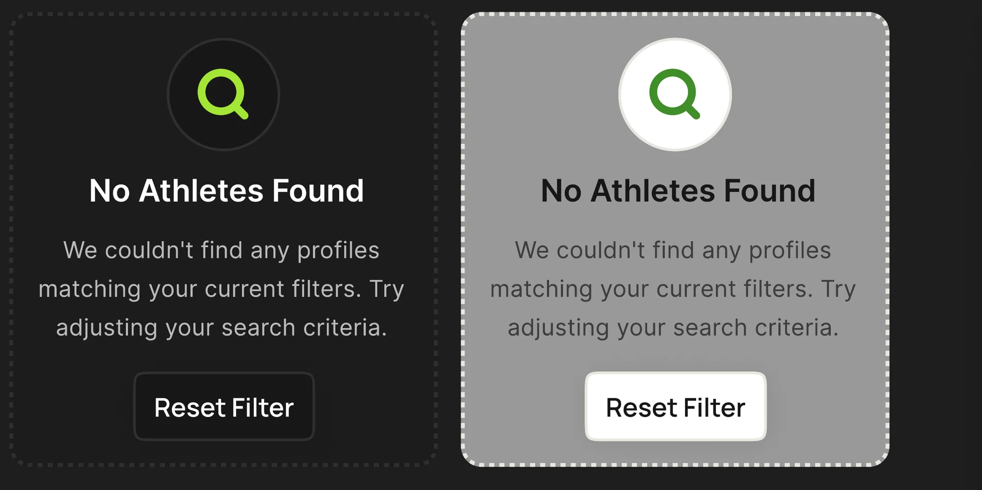
Molecule · Empty state
No results
No Athletes Found
We couldn’t find profiles matching your filters.
Organism · Portfolio onboarding
Step 1
- 1 Basics
- 2 Background
- 3 Journey
- 4 Goals
- 5 Social
- 6 Additional
Step 1 of 6 · Basics
Back keeps everything you entered.
| Family | What changes | What stays recognisable |
|---|---|---|
| Actions | Primary or secondary, size, icon, fluid width, active or disabled outline | Action hierarchy and brand treatment |
| Inputs | Short or long content, placeholder or filled, container width | Label, field boundary and text hierarchy |
| Navigation | Active destination, module, viewport | A visible current location |
| Search | Collapsed or expanded filters, active tags, empty results | A clear way to refine or reset |
| Athlete data | Sport, statistic, achievement or season | The same label-and-value hierarchy |
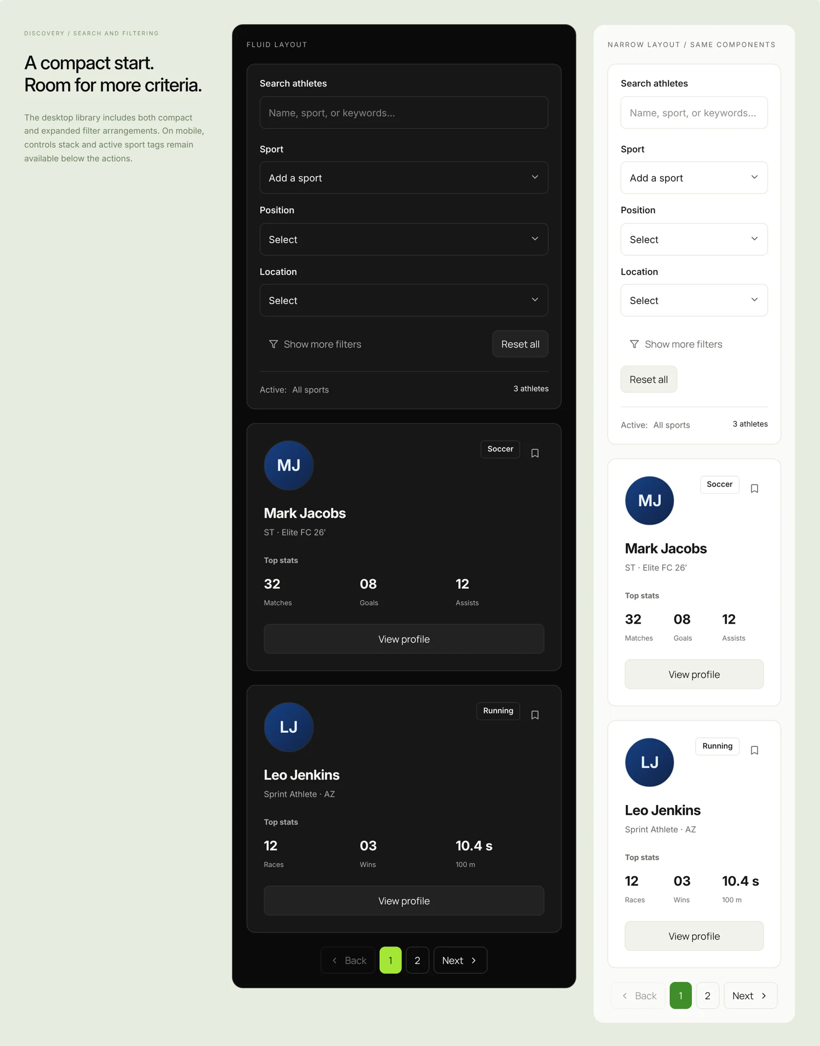
A documented rule, demonstrated
Same component.
Different container.
- Field
- width: 100%
- Parent
- grid / flex
- Fluid CTA
- forms + pricing
Parent container
Current team
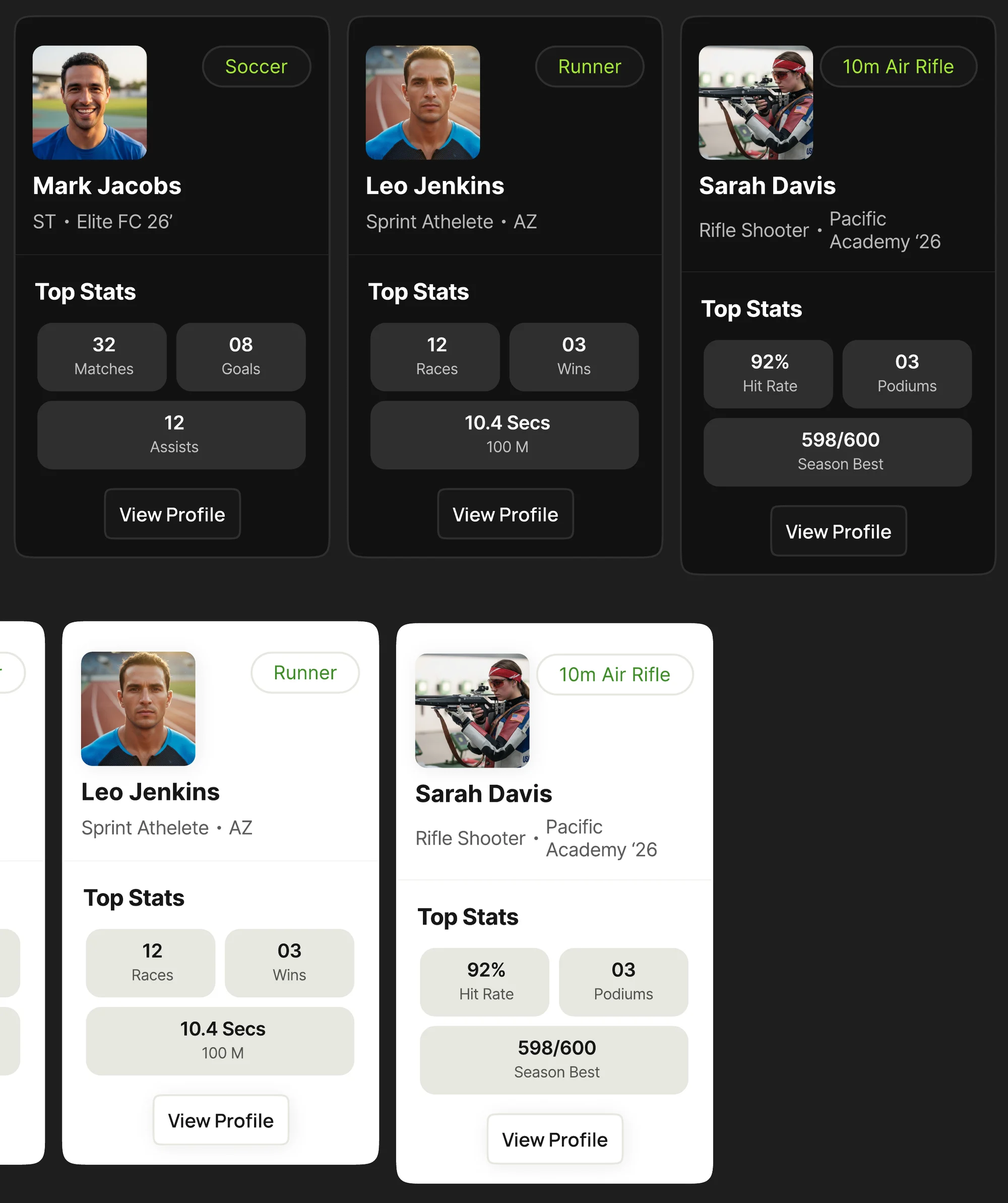
| Sport | Top stats on the card |
|---|---|
| Soccer | Matches · Goals · Assists |
| Running | Races · Wins · 100 m time |
| Air rifle | Hit rate · Podiums · Season best |
Do
- Make buttons fluid only on forms and pricing.
- Size widths from the grid, not from the component.
- Give every empty state a way out, such as Reset Filter.
Don’t
- Stretch buttons to fill a row anywhere else.
- Leave a search with no results and no next step.
- Build one-theme components; every part ships in dark and light.
Handoff
Appearance, behaviour and context.
The handoff had to answer what engineers would otherwise guess: how a part looks, how it behaves, and where it belongs.
| Deliverable | What it contained |
|---|---|
| Brand and identity | Logo, naming treatment, colour and typography |
| Design system | Foundations, reusable components and responsive patterns |
| Product design | Website wireframes and final interface designs |
| Developer handoff | Designs and component references for production, with theme counterparts, interaction states and desktop and mobile compositions |
The original deliverable was design documentation. Afterwards I rebuilt the library in React and TypeScript to test the specification in code: Base UI for keyboard and focus behaviour, native inputs for validation and autofill, aria-sort on tables, aria-current on pagination, live regions for form messages, and container queries so parts rearrange to the space they actually get.
Accessibility
Contrast, checked against the real tokens.
Accessibility is checked where colour is defined, in the tokens, so every screen inherits the result.
Recruiters process a lot of numbers quickly, so legibility is the product. Checking every text pairing against WCAG 2.2 shows the dark theme passes everywhere, including subtext at 55% white. The light theme is closer to the line: Forest Green and the 55% inactive-navigation grey pass for large text and icons, but fall short for small text.
| Pair | Ratio | Needs | Result | Refinement |
|---|---|---|---|---|
| Dark · Body text on page | 19.68:1 | 4.5:1 | Pass | - |
| Dark · Subtext (White/70) on card | 9.13:1 | 4.5:1 | Pass | - |
| Dark · Inactive nav (White/55) | 6.24:1 | 4.5:1 | Pass | - |
| Dark · CTA label on Lime | 13.05:1 | 4.5:1 | Pass | - |
| Light · Body text on page | 17.14:1 | 4.5:1 | Pass | - |
| Light · Subtext (Gray/70) | 6.50:1 | 4.5:1 | Pass | - |
| Light · Inactive nav (55%) | 3.94:1 | 4.5:1 | Below AA | Raise to 60% opacity → 4.60:1 |
| Light · White label on Forest Green | 4.10:1 | 4.5:1 | Below AA | Darken green to #3A8226 → 4.77:1 |
| Light · Forest Green text on page | 3.92:1 | 4.5:1 | Below AA | Darken green to #3A8226 → 4.56:1 |
Try it
Try the system.
This card is built in code from the same tokens, not a screenshot. Switch themes, or let it follow your device the way SportsMarkers does, and watch the contrast check update.
Following your device: dark
Live contrast check
- Body text on page19.68:1AA
- Subtext on card9.13:1AA
- CTA label on accent13.05:1AA
- Accent on page13.05:1AA
Ratios are calculated from the shipped token values. Small text needs 4.5:1; icons and large text need 3:1.
What I took from it
What I took from it.
The brand makes talent recognisable.
The system makes the experience consistent.
The portfolio makes performance visible.
- 01
Let the theme carry the audience.
Showcase in dark, work in light. Two audiences, one set of components.
- 02
Write the rule, not just the part.
A sentence about when a button is fluid saved more inconsistency than another variant would have.
- 03
Contrast belongs to the token.
Check a pairing once, when the token is defined, and every screen inherits the answer.
- 04
A mark should explain itself.
One stroke, one axis, one metaphor anyone on the team can retell.