
Improving Usability and Navigation on Greystar’s Platform
The primary goal of the usability test conducted on Greystar was to evaluate the user experience and identify areas for improvement. Specific objectives and goals included assessing the website's navigation, functionality, and overall usability to ensure a seamless and efficient user journey.
Real Estate
UI/UX Designer
Figma, FigJam, Google Forms
20 Aug 2023 - 1 Dec 2023 (Fall Semester)
Challenge
Users encountered challenges in locating key features such as property listings, filters, and management tools. Participants faced difficulties in completing common tasks such as finding the leasing button, problematic functionality of the filter and option and accessing contact management button. These were some of the problems that users encountered in the preliminary survey.
Results
35%
Improved functionality
25%
Increase in user retention
The redesigned app features a streamlined interface, ensuring effortless navigation and seamless access to essential features like property listings, filters, and management tools.
Improvements in onboarding have resulted in a 35% increase in new user adoption, addressing previous challenges users faced in locating key functionalities.
Enhancements have significantly improved user engagement, leading to a 25% increase in retention rates by simplifying task completion.
Process / Methodology
Initial Analysis: I conducted Heuristic Analysis using Nielsen’s 10 heuristic principles for evaluation to analyze usability issues, measured and against a Jeff Rubin's severity scale which helped in downsizing and defining the problem statement to focus on.
User Research: Conducted user surveys and collected 11 responses, contributing to user data analysis and insights which further helped in shortlisting the problems to prioritize.
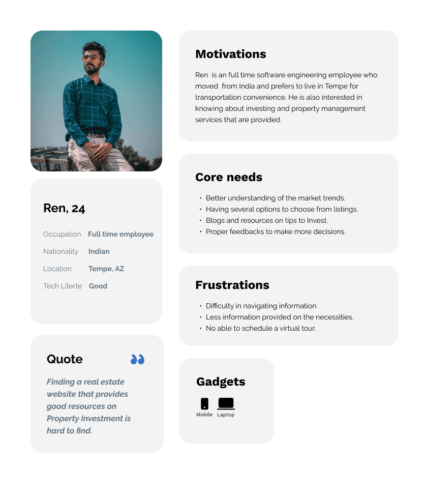
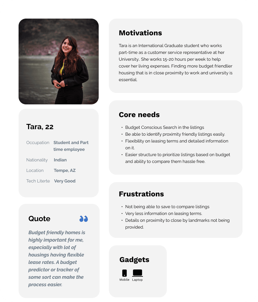
User Persona and User Stories : Developed three representative user personas based on user research and defined four user goals, each accompanied by two tasks that the personas would aim to accomplish on the website. These steps were essential to ensure that the development of wireframes aligns with user needs, enhances usability, and supports intuitive navigation.
Usability Testing: Conducted task scenario-based usability tests on the current website with five participants to identify and assess usability issues. This process was crucial in assessing and validating pain points, improving user experience, and informing design enhancements.
Wireframes and Prototype: Designed the web application prototypes to address key issues identified through prior evaluations and research. This step was essential to refine the user experience, enhance functionality, and ensure the design effectively meets user needs.
User Research
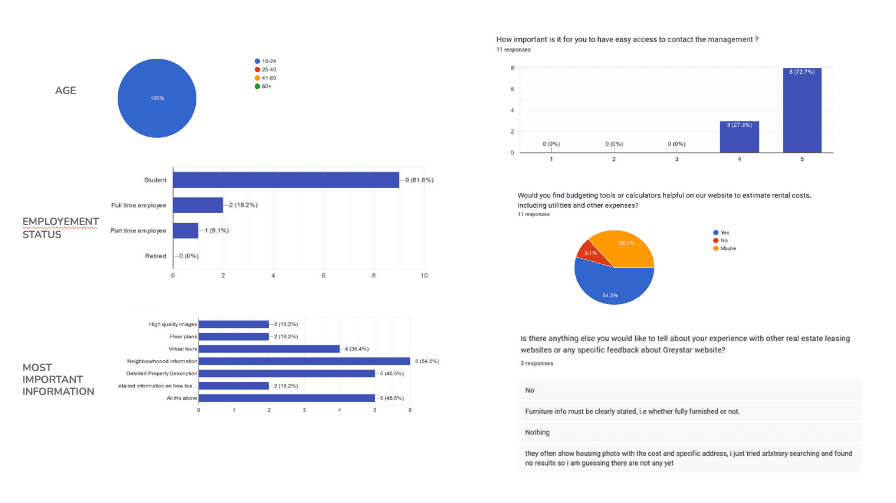
Study Highlights: 4/5 Participants wanted information on nearby Transportation and all of them felt the website wasn't intuitive. 3/5 participants didn't use the search bar present in the landing page. 4/5 participants tried to navigate to the career page but weren't able to return to the home screen.
User Personas

Usability Testing Materials
To enhance the user experience on the website of Greystar, a comprehensive usability test is being conducted. The website serves as a vital information hub for individuals searching for housing and property investment resources. Additionally, it also caters to prospective residents by providing a portal to check up on the status of their rent payments, etc. The recruited participants will be performing several tasks based on user story scenarios. An evaluation of their journey in achieving the goal will be done to validate the assumptions made using the user research survey data.
Scenarios/Tasks
User Goal 1
As an International Student and Part-time employee, I want to compare the available listings so that I can get better visibility in choosing.
Scenario
The user is searching for new homes and is looking up apartment listings and wants to find appropriate responses to get a comparative analysis of all available housing based on their requirements.
Task 1
Navigate through the webpage to search for apartments as per your convenience and requirements, such as amenities, neighbourhood information, flooring plans, etc.
Task 2
Save the different choices of apartment listings.
Explanation
User research shows that 45.4% of users struggle to navigate the website to find information, while 45.5% want better apartment comparisons, including details like neighborhood, leasing, and floor plans. Task 1 will analyze the user journey to identify pain points. Task 2 will evaluate the current comparison feature and explore potential improvements.
User Goal 2
As an International Graduate Student, I want to know more details on leasing so that I can be sure of which agreement would be right for me.
Scenario
The user has shortlisted a couple of apartments and, after comparison, would like to look at the leasing information of both apartments and see which agreement would fit right with the nature of the stay.
Task 1
Find a one-year lease agreement for an apartment and its pricing.
Task 2
Look for more information on the leasing agreement in relevance to the house being furnished or not.
Explanation
User research shows that 63.5% of participants want to evaluate housing options based on property descriptions and leasing agreements. Providing easy access to this information would enhance user experience and help streamline apartment listings to better match user needs.
User Goal 3
As an International Student and Part-time employee, I want to see nearby landmarks to get to know the easier way to access them.
Scenario
The user would want to look for an apartment that is in close proximity to their university and other stores to have an easier lifestyle and save time.
Task 1
Search for apartments with location preferences while considering desired proximity to nearby landmarks and distance-related requirements.
Task 2
Search these apartments using meet specific amenities and other needs.
Explanation
These tasks will help deduce if the filters and search are effective when it comes to highly specific searches and if the listings provided are being user-focused listings and not just generalised.
User Goal 4
As a Full Time Employee, I want to get a tour of the property to decide if it meets the standards as provided in the description.
Scenario
The user, after seeing the photos and videos of the apartment, would look for legit proof that proves it meets the criteria as mentioned and shown in the listing.
Task 1
Scheduling a video/ In-Person tour on the available date according to their preference.
Task 2
Find out how to contact the leasing office on the website.
Explanation
Based on the user research data, we can see that 63.6% of the people want to schedule an in-person visit, and the rest of the people prefer a virtual tour. 72.7% of the people want to contact the management easily through these web forms and would want to know the progress with the point of contact. Through these tasks, we can figure out how the flow of the website meets the user's needs coherently with their process of finalising an apartment.
Think Aloud Comments

Design Components

Wireframes and Recommendations

Issue Addressed: Participants had problems with navigating from homepage to search for apartments.
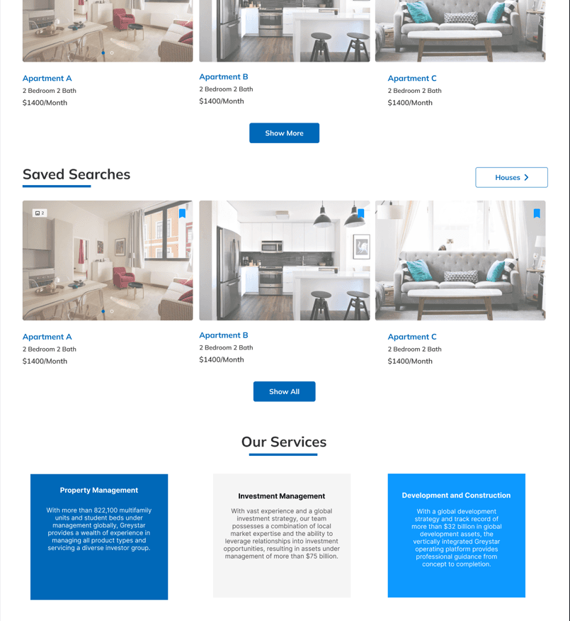
Solution: Solving the navigation problem through making one navbar instead of having the existing two navigation bars, Addition of new sections such as Trending Listings and Saved Searches and making the background as image for the hero section instead of a video which was a distracting factor.
Issue Addressed: Participants had problems with no such description provided anywhere about furnished or unfurnished and it was an essential information for all users. Lack of information about property furnishings was a critical gap in the data presented to users.
Solution: Addition of such a tab/description in the initial screening zone of the page .

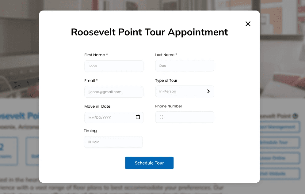
Issue Addressed: Participants weren’t able to locate the scheduling tour option and it was essential for them to have it before finalizing on a property
Solution: Addition of Scheduling tour button in the accessible area and a form from it
Issue Addressed: Participants felt that the saved option that keeps popping up after every addition was annoying.
Solution: The Compare section overlay appears only when the users clicks on it and meanwhile after every addition the the number of saved options will be indicated alongside.


Issue Addressed: Participants felt the need for nearby landmarks and public transportation nearby would be highly helpful in identifying the proximity from the property.
Solution: Addition of an interactive landmark section where users can click on the given landmark and see the pinned location and shows various transportations that are available nearby.
Inference
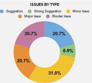
The Greystar website was evaluated and tested in order to identify usability issues. The resulting data was analyzed to support the necessary revisions in order to increase overall user experience. 9 usability issues were identified and iterated over to improve the usability of the interface and hence, experience. In order to provide seamless order experience and overall, I would like to continue this study and iterate it over to mobile as well. Currently, this study was conducted to improve the website experience, I would like to improve the experience of mobile responsiveness as well.